The Psychology of Color in Retail Store Design: Creating Atmospheres That Drive Sales
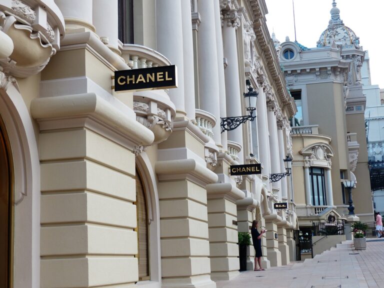
Color plays a crucial role in shaping the ambiance and perception of a retail store. Different colors evoke various emotions and can influence consumer behavior in subtle yet powerful ways. For example, warm tones like red and orange are often associated with energy and excitement, making them suitable for attracting impulse buyers.
On the other hand, cool colors like blue and green have a calming effect and can encourage a sense of trust and reliability in customers. By strategically incorporating these colors into the design scheme of a retail space, store owners can create a welcoming environment that resonates with their target audience. Properly leveraging color psychology can ultimately lead to increased foot traffic, longer dwell times, and higher sales conversions.
Red and orange colors are associated with energy and excitement
Warm tones can attract impulse buyers
Blue and green colors have a calming effect
Cool colors can encourage trust and reliability in customers
Strategic use of color psychology in retail store design can lead to increased foot traffic, longer dwell times, and higher sales conversions.
The Impact of Color on Consumer Behavior
Color plays a significant role in influencing consumer behavior within retail environments. Research has shown that different colors have the power to evoke specific emotions and perceptions in consumers. For example, warm tones like red and orange are often associated with excitement and energy, while cool tones like blue and green can create a sense of calm and trust.
In addition to evoking emotions, color can also impact how consumers perceive a brand’s image and identity. The strategic use of color in retail store design can help communicate a brand’s values, personality, and positioning in the market. By understanding the psychological effects of color on consumer behavior, retailers can create a visually appealing and cohesive brand experience that resonates with their target audience.
Creating a Visual Brand Identity Through Color
Color plays a crucial role in establishing a visual brand identity that resonates with consumers. The strategic use of colors in branding can evoke specific emotions and perceptions, influencing how customers perceive a brand. From the bold red of Coca-Cola to the calming blue of Facebook, colors are carefully selected to communicate the values and personality of a brand.
When choosing colors for a brand identity, it’s essential to consider the psychological impact of each color. For example, warm tones like red and orange are often associated with energy, passion, and excitement, making them ideal for brands looking to convey a sense of vitality. On the other hand, cool colors like blue and green are linked to serenity, trustworthiness, and nature, making them suitable for brands aiming to evoke feelings of calm and reliability. By understanding the psychology of colors, brands can create visual identities that effectively communicate their unique message and connect with their target audience.
How can color psychology be utilized in retail store design?
Color psychology can be utilized in retail store design by choosing colors that evoke emotions and feelings in customers, ultimately influencing their behavior and purchasing decisions. For example, warm colors like red and orange can create a sense of urgency and excitement, while cool colors like blue and green can promote feelings of calm and relaxation.
What impact does color have on consumer behavior?
Color can have a significant impact on consumer behavior, as it can influence emotions, perceptions, and purchasing decisions. Different colors can evoke different feelings and associations, leading customers to make subconscious choices based on the colors they see in a retail environment.
How can businesses create a visual brand identity through color?
Businesses can create a visual brand identity through color by choosing a color palette that reflects their brand values and personality. Consistency in color usage across all branding materials, such as logos, packaging, and marketing materials, can help reinforce the brand identity and make it more recognizable to customers.